User Experience
Information Architecture
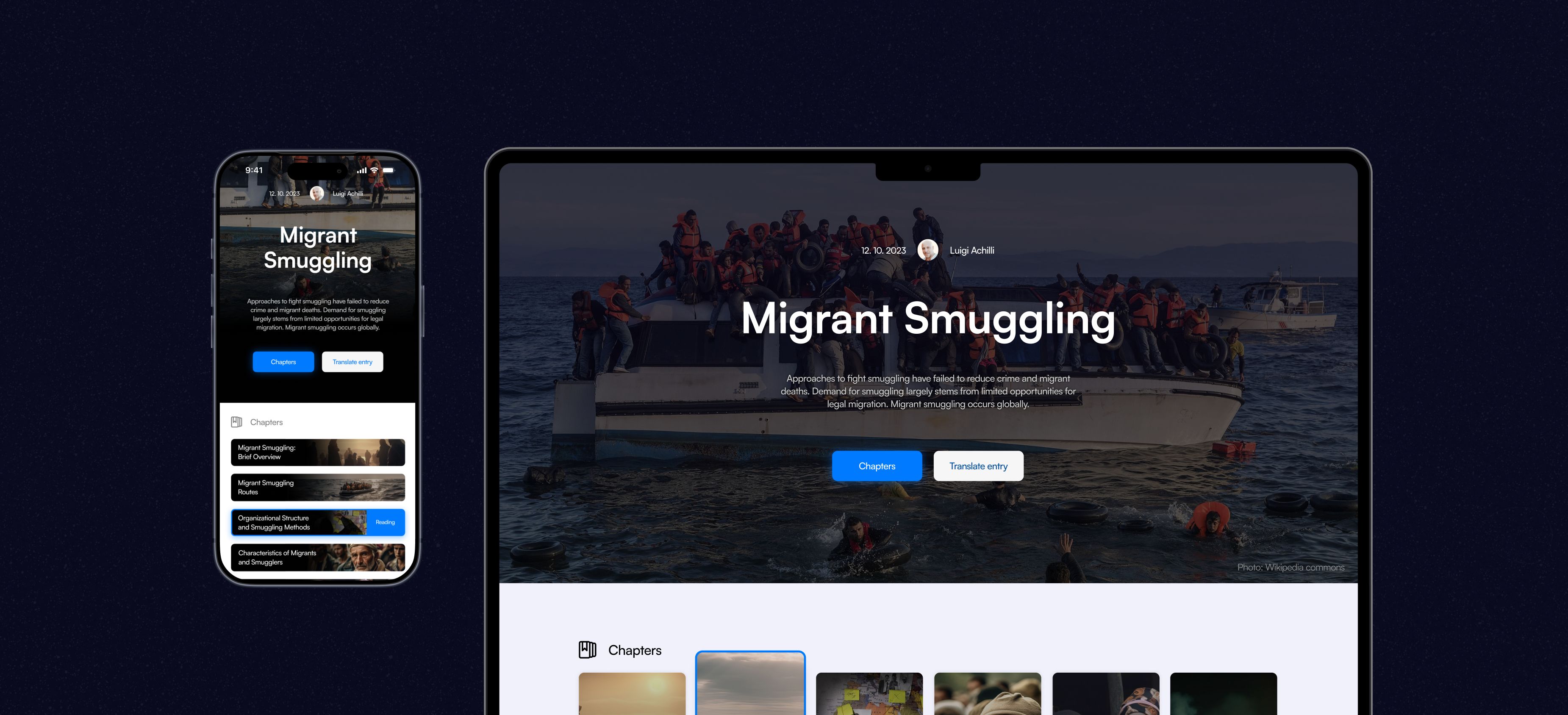
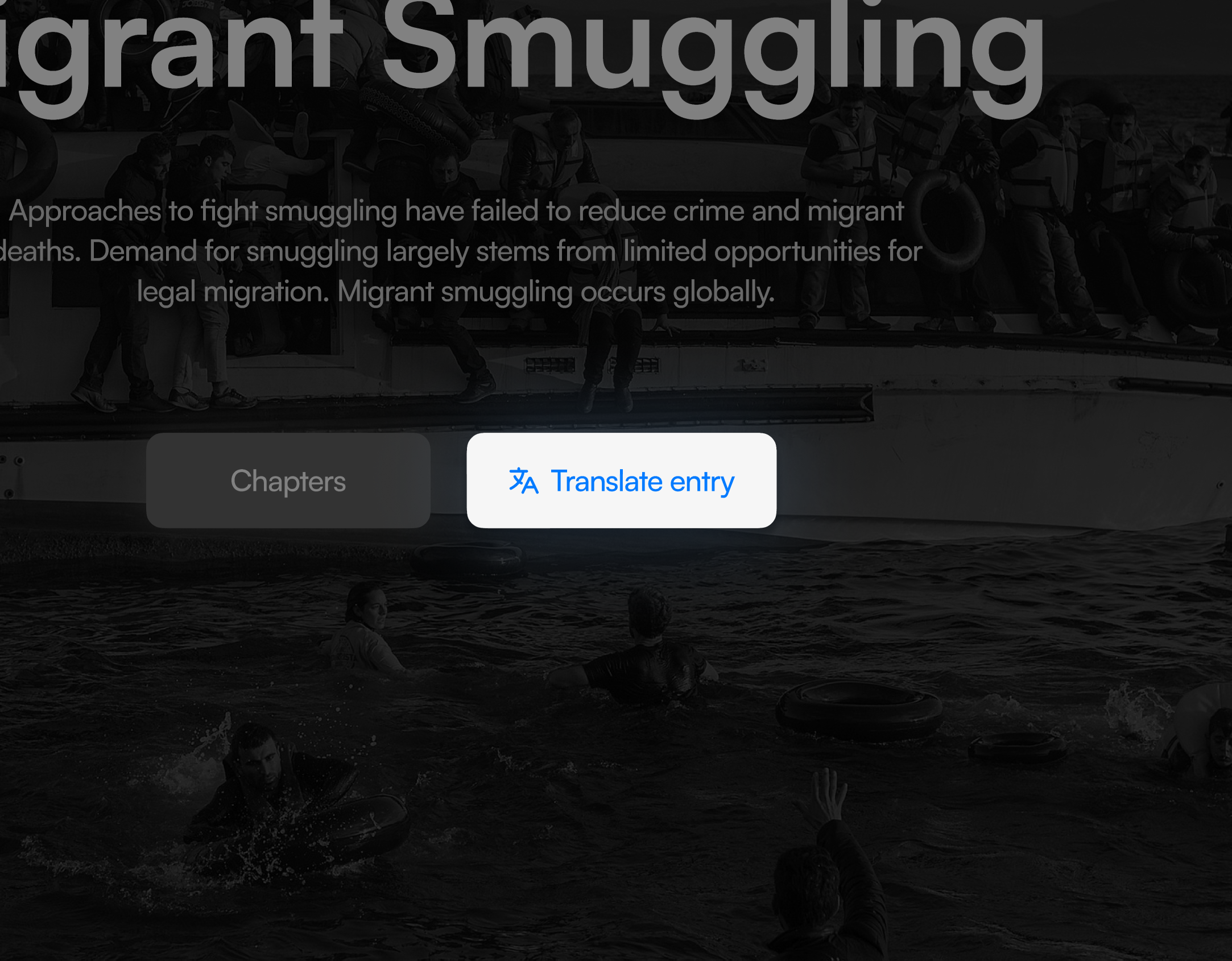
Atlas: A redesign. Popularising academic content

As the only in‑house designer, I led a redesign of the content hierarchy, introduced high‑engagement UX patterns inspired by entertainment platforms, and created AI-powered tools for interacting with the content. This made complex content easier to discover, navigate, and more relevant to curious readers.
User research revealed that users got lost in the content, felt discouraged by the density of the information, and often formed negative expectations before the content had a chance to engage them. The challenge was to make serious knowledge feel more approachable.
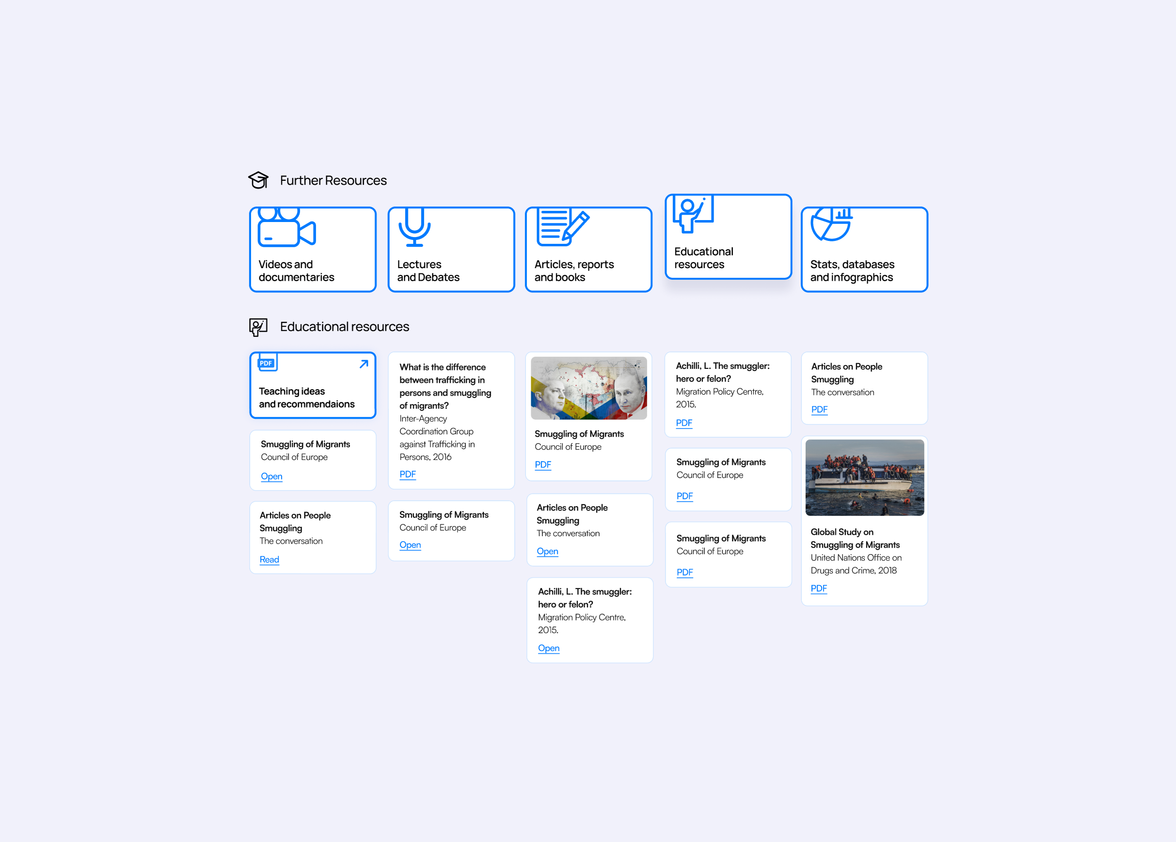
At the same time, the consumption experience had to balance the needs of a broad and sometimes competing group of stakeholders, including authors, donors, teachers, media, and the curious public.
The design also had to build on top of a fixed database structure across web and mobile, which limited how far the content format itself could be changed.
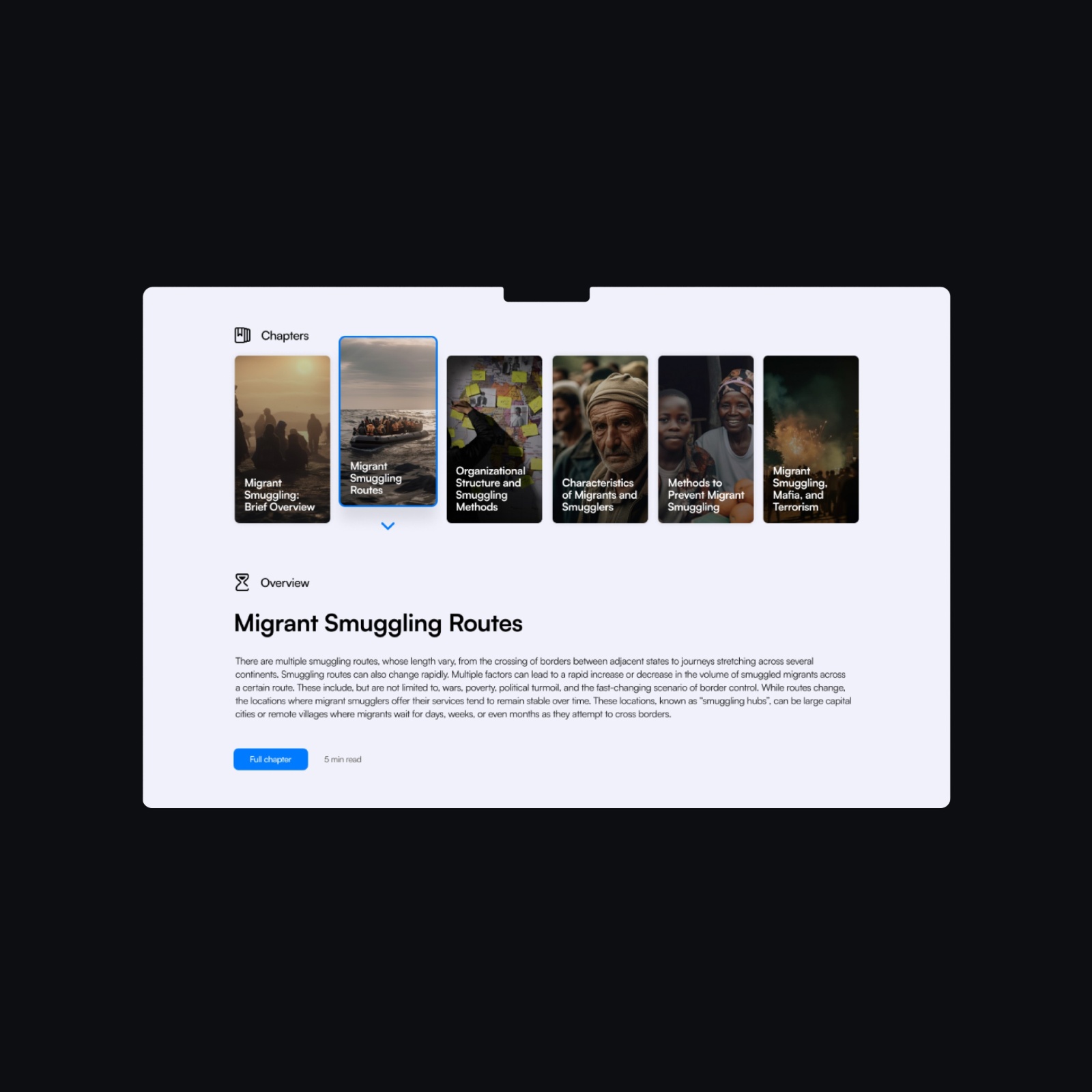
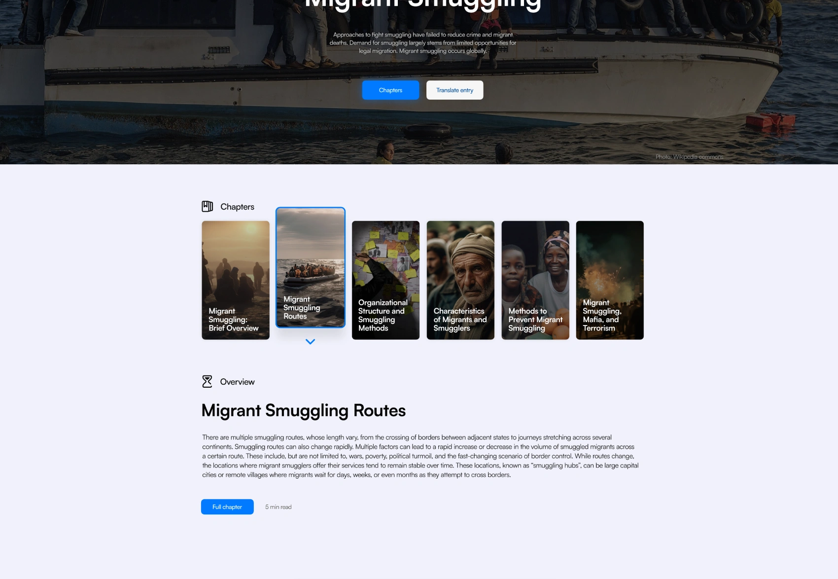
A more discoverable structure

Designing with familiar interaction patterns
I pushed the interface from a Wikipedia-style reading model to a more discovery-driven content experience.
Design language for trust and engagement
Because trustworthy and engaging rarely come together by default, I built a design system that deliberately balanced both: visual energy to spark interest, and enough structure and restraint to make the content feel credible.
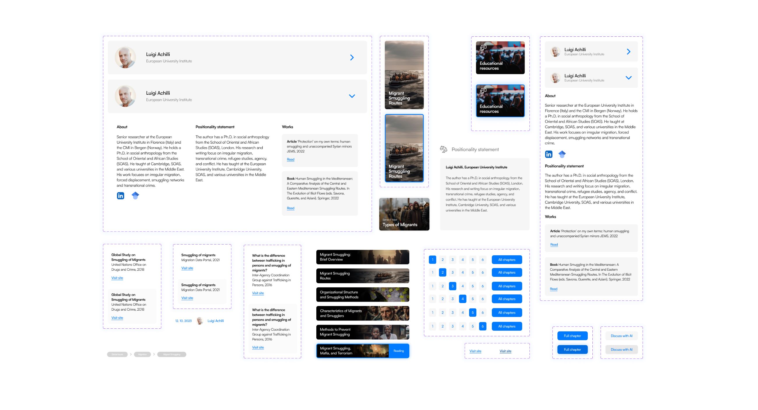
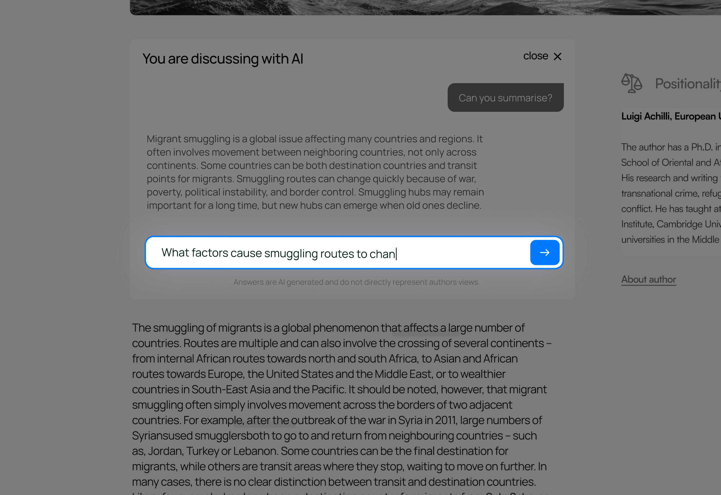
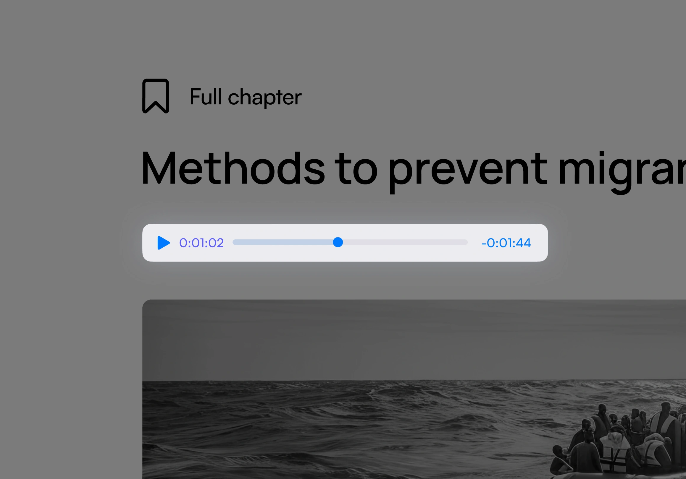
Using AI to support curiosity.
AI features help meet curious readers where they were. Listening and discussion modes make complex topics easier to follow and explore without needing to read long academic paragraphs.
€80K non‑dilutive funding approved.
Improved usability.
First paying users.